


Table of Contents
- Start With Scale: Your Living Room Art Sizing Guide
- How to Arrange Gallery Walls That Actually Work
- Choosing Art for Different Interior Design Styles
- Color Palette, Visual Balance, and Composition
- Original Artwork vs. Fine Art Prints: What to Budget For
- Art Preservation, Digital Frames, and Non-Standard Layouts
- How to Choose Living Room Art That Reflects Your Personality
- Conclusion
Start With Scale: Your Living Room Art Sizing Guide
Getting the scale right is the single most important decision when choosing living room art. A piece that's too small floats awkwardly on the wall; one that's too large overwhelms the room. Living room art sizing is the practice of matching artwork dimensions to surrounding furniture and wall space to create visual balance and a coherent focal point.
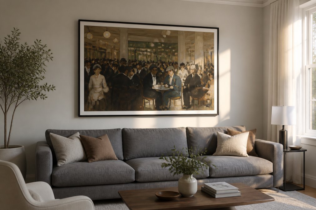
The 2/3 Rule for Sofa and Furniture Configurations
The 2/3 rule is the most reliable living room art sizing guide: your artwork or art grouping should span roughly two-thirds the width of the furniture below it. For a standard 84-inch sofa, that means your piece or arrangement should be approximately 56 inches wide. This creates visual weight that anchors the sofa without competing with it.
For a sofa without flanking tables, apply the rule to the sofa width alone. For a sectional, measure the longest continuous section. When hanging multiple pieces as a group, treat the entire arrangement as a single unit.
A single large canvas above a sofa typically looks best when its bottom edge sits 6 to 8 inches above the top of the furniture. Any closer and the piece feels cramped; any higher and the visual connection breaks.
Hanging Height: The Eye-Level Standard
The eye-level standard puts the center of the artwork at approximately 57 to 60 inches from the floor. This matches the average standing eye level and is the standard used by galleries and museums.
The most common mistake is hanging art too high. If you're hanging art above a sofa where viewers will primarily be seated, drop the center point slightly lower to account for the seated sight line.
| Configuration | Recommended Center Height | Bottom Edge Clearance |
|---|---|---|
| Above sofa (standing viewing) | 57-60 inches from floor | 6-8 inches above sofa back |
| Above sofa (seated viewing) | 52-55 inches from floor | 4-6 inches above sofa back |
| Standalone wall (no furniture) | 57-60 inches from floor | N/A |
| Above fireplace mantel | Top of mantel + 4-6 inches | Flush or slight gap |
| Gallery wall arrangement | Center of grouping at 57-60 inches | Varies by layout |
How to Arrange Gallery Walls That Actually Work
Most gallery walls fail because people start hammering nails before planning. The result is uneven spacing, mismatched visual weight, and a composition that looks accidental.
Planning Your Layout Before You Hang Anything
Plan the entire arrangement on the floor first. Lay your frames out on kraft paper or newspaper, trace each one, and cut out the shapes. Tape those paper templates to the wall with painter's tape and live with the layout for a day before committing.
When planning your composition:
- Anchor piece first. Identify the largest or most visually dominant piece and place it slightly left of center for dynamic tension.
- Consistent spacing. Two to three inches between frames is standard. Wider gaps feel scattered; tighter gaps feel cluttered.
- Visual balance over symmetry. A large piece on one side can be balanced by two or three smaller pieces on the other.
- Negative space. Leave breathing room around the outer edges so the arrangement doesn't bleed into the ceiling or adjacent walls.
According to the American Society of Interior Designers' resource library, the most successful gallery walls share a unifying element, consistent color palette, repeated frame finish, or cohesive theme, rather than relying on random variety.
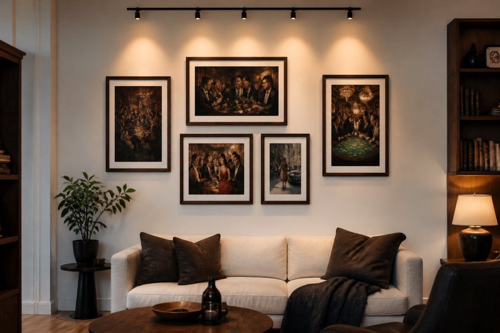
Mixing Frames, Matting, and Mediums Without Chaos
The secret to mixing frames successfully is to commit to one unifying variable: consistent frame color, consistent matting width, or consistent medium. Then let everything else vary.
A wide white mat transforms a modestly sized print into something gallery-quality and creates breathing room around the image. For most prints, a mat adding 2 to 3 inches on each side is the right proportion.
Mixed media works well when color palettes speak to each other. What kills a mixed-media gallery wall is tonal chaos: warm-toned photographs next to cool-toned abstracts with no connecting logic.
Choosing Art for Different Interior Design Styles
The art you choose communicates something before anyone reads the title. It sets the emotional register of the room.
Minimalist and Modern Spaces
Minimalist and modern rooms are defined by restraint. The art you introduce becomes the primary visual event, carrying enormous weight. A single large-format statement piece almost always outperforms a gallery wall.
What works: large-scale abstract art with a limited color palette (two or three colors maximum), black-and-white photography with strong compositional lines, or fine art prints with significant negative space. Avoid busy compositions, ornate frames, or anything competing with the architecture. The frame should be thin, matting white, and the art should do all the talking.
Maximalist, Eclectic, and Traditional Rooms
Maximalist and eclectic rooms operate by different rules. Gallery walls thrive here. Mixed media feels at home. Ornate gilded frames, bold color, and layered texture all have a place.
Traditional rooms call for art that respects formality: landscapes, portraiture, and classic compositions in substantial frames. Eclectic rooms are where you can take risks with contemporary fine art prints, sports photography, and vibrant cultural scenes alongside vintage maps or botanical illustrations.
The one rule across all styles: the art should feel chosen, not default.
Color Palette, Visual Balance, and Composition
Color coordination between art and room is about conversation, not matching. Pull one or two accent colors from the artwork and echo them in soft furnishings: throw pillows, rugs, or a side table.
Visual balance follows interior styling principles generally. Heavy visual weight (dark colors, dense compositions, large formats) should be distributed across the room rather than concentrated in one area. A large, dark-toned piece above the sofa works better when balanced by a lighter piece or reflective surface on the opposite wall.
Composition within the artwork also matters. Art with strong horizontal lines reinforces calm and stability, good for relaxation spaces. Diagonal compositions and dynamic abstract art introduce energy, working well in social spaces.
As the Color Association of the United States notes, color perception changes significantly under different lighting conditions. Before committing to a piece, view it under both natural daylight and your room's artificial lighting.
Original Artwork vs. Fine Art Prints: What to Budget For
Original artwork and fine art prints serve different purposes. Original artwork is singular, carrying provenance and the physical evidence of the artist's hand. Works passing through major auction houses like Christie's, Sotheby's, and Phillips carry verifiable market histories and tend to hold or appreciate in value.
Fine art prints, when produced at museum quality, close much of that gap. The critical variable is the printing process and material. Prints on thick, archival matte paper with high-resolution color reproduction preserve the artist's intent far better than mass-produced alternatives.
For most living rooms, a high-quality fine art print is the smarter practical choice. It allows you to acquire work from artists represented by prestigious galleries without the acquisition costs of originals.
Art Preservation, Digital Frames, and Non-Standard Layouts
Protecting Your Art From Light and Humidity
Art preservation matters more than most people realize, particularly for fine art prints and works on paper. The primary enemies are ultraviolet light and humidity fluctuation. UV exposure causes fading and color shift over time, even in archival prints. Direct sunlight is most aggressive, but UV also comes from standard incandescent and fluorescent bulbs.
Practical preservation steps: hang art away from direct sunlight and south-facing windows, use UV-filtering glass or acrylic in frames for valuable pieces, maintain indoor humidity between 45 and 55 percent, avoid hanging art above radiators or HVAC vents, and use frames with sealed backing for matte paper pieces.
According to the Library of Congress preservation guidelines, light damage to paper-based works is cumulative and irreversible. Keep light exposure as low as practical and rotate displayed works periodically.
Digital Art and Smart Frames for Modern Living Rooms
Digital frames have matured significantly. Current-generation smart frames offer screen resolutions and anti-glare finishes that credibly replicate framed prints under gallery lighting. For collectors wanting to display a rotating curated collection without committing wall space to multiple physical pieces, they represent a useful option.
Digital displays still read as screens in direct light and cannot replicate the tactile quality of paper or canvas. For a primary statement piece, a physical fine art print remains stronger. Digital frames work best as supplementary display in secondary positions.
Art Placement in Awkward or Non-Standard Rooms
Non-standard layouts require different approaches. In narrow rooms, vertical compositions draw the eye upward and create height. Avoid wide horizontal arrangements that emphasize narrowness. In rooms interrupted by multiple doorways, treat each available wall section as its own display zone.
Angled ceilings and exposed beams can become assets. Art hung below a beam or within a defined architectural pocket feels intentional. Align artwork with the space's geometry rather than fighting it.
How to Choose Living Room Art That Reflects Your Personality
The practical rules above are tools for execution. But the art you choose to live with is a different kind of decision, about what you actually want to look at every day, what moves you, what tells your story.
A common mistake is choosing art defensively: picking something safe and neutral. The result is a living room that feels like a hotel lobby. The most compelling living rooms are built around art that takes a position: a vibrant cultural scene that mattered to you, a sports photograph capturing athletic achievement you find thrilling, or an abstract work whose color and energy you respond to viscerally.
The psychological impact of art in a living room is cumulative. The piece you see every morning, glance at during conversations, and watch catch light differently at dusk shapes the emotional character of the space in ways furniture and paint cannot.
Filipp Jenikae Art Prints offers a curated collection of unique, museum-quality fine art prints that capture the vibrant energy of popular culture, sports, and social scenes. Each piece is meticulously printed on thick, Japanese-sourced matte paper, ensuring that every detail and color palette remains vivid and alive. Designed for art lovers and enthusiasts of iconic cultural moments, our collection brings personality and movement into any space. We are committed to providing a personal, direct service experience, ensuring that every customer finds the perfect artwork to elevate their home.
The question to ask when choosing living room art isn't "will this match my sofa?" It's "will I still want to look at this in five years?" If the answer is yes, you've found the right piece.
Choosing the right living room art is both a technical problem and a personal one. Get the scale wrong and even a beautiful piece falls flat. Get the scale right but choose something that doesn't reflect who you are, and the room still feels hollow. Filipp Jenikae Art Prints offers a curated collection of museum-quality fine art prints on thick archival matte paper, with a 30-day return policy and direct personal service. Browse the collection and find the piece that belongs on your wall.
Frequently Asked Questions
Q: What is the 2/3 rule for living room wall art?
A: The 2/3 rule states that a piece of wall art should span roughly two-thirds the width of the furniture below it. If your sofa is 84 inches wide, aim for artwork that measures around 56 inches across. This creates visual balance without overwhelming the piece or getting lost on the wall. For a gallery wall grouping, treat the entire arrangement as one unit and apply the same two-thirds proportion to the total cluster width.
Q: How high should art be hung in a living room?
A: The standard is to hang artwork so its center sits at approximately 57 to 60 inches from the floor, which aligns with average eye level when standing. When art hangs above a sofa or console, leave 6 to 8 inches of space between the top of the furniture and the bottom of the frame. In rooms where you spend most time seated, such as a media room, dropping the center point slightly to around 54 inches can feel more natural.
Q: What art looks good in a living room?
A: The best living room art is whatever creates a clear focal point and connects to the room's existing color palette and personality. Abstract art works well in modern and minimalist spaces, while figurative prints, cultural scenes, or sports-themed pieces add energy and character to eclectic or contemporary rooms. Scale matters as much as style: a single statement piece above the sofa often reads better than several small prints scattered across a large wall.
Q: What is the 3-5-7 rule of decorating?
A: The 3-5-7 rule is a grouping principle that suggests arranging decorative objects, including framed art, in odd numbers. Groups of three, five, or seven feel more dynamic and visually interesting than even-numbered arrangements, which can look too symmetrical and static. When building a gallery wall, choosing an odd number of pieces as your anchor grouping tends to produce a more curated, intentional result than a grid of four or six identical frames.
Q: How do I choose art that matches my living room furniture?
A: Start with your dominant upholstery color and pull one or two secondary tones from it. Look for artwork that echoes those tones without matching them exactly; contrast creates interest, while coordination creates cohesion. Texture matters too: a matte fine art print complements fabric sofas well, while high-contrast photography can balance leather or wood-heavy rooms. If your furniture is neutral, almost any color palette in the art will work, giving you maximum creative freedom.
Q: Should I choose original artwork or fine art prints for my living room?
A: Both are valid choices depending on your budget and goals. Original artwork carries investment potential and is one-of-a-kind, but costs significantly more. Museum-quality fine art prints on thick matte paper can deliver comparable visual impact at a fraction of the price, especially when professionally framed. For most living rooms, a high-quality print from a reputable source is indistinguishable from an original at normal viewing distance and offers far more flexibility when refreshing your space.
This article was written using GrandRanker


